D1 — The Doors
The Doors’ strangely enigmatic logo is the best known of a succession of typographic gems created by Elektra Records in the late 1960s. The man with his hand firmly on the visual tiller was art director William S Harvey.

Elektra founder Jac Holzman was one of the first US record company chiefs to properly tap into the power of design and branding. A small fish in a big pond, he knew that he had to stand out to compete with the majors.
When he brought in the super-talented designer and photographer William S Harvey as art director in 1958, rivals were bemused. But before long, Elektra (together with Nonesuch, Holzman’s budget classical label) were sporting the ‘best-dressed’ covers around. Not to mention some of the most recognised logos.
Harvey’s son Bill Harvey (also a successful graphic designer) told us: “My father was at Elektra on the cusp of it changing from a folk-rock label to a rock label. The Doors were a big part of that, the golden gooses. He was a prolific illustrator and incredible master of typography. He and Jac were very different and had a fiery relationship, but they respected each other deeply. Having worked in this industry all my life, I’ve found the best creativity is often the result of some sort of conflict.”

On the cover of ‘The Doors’, the logo is rendered in a bright, almost fluorescent green atop of Guy Webster’s dark, moody photographic band montage, with Jim Morrison’s brooding face taking up half the cover.
When Holzman signed The Doors in 1967, they’d been passed up by several other labels. However, his gut instinct paid off handsomely, when their debut album, ‘The Doors’, started flying off the shelves. And their quirky outline logo quickly became part of the band’s mythology.
As part of the build-up to the album’s release, Harvey scored a huge coup in music advertising, when Elektra became the first label to put up a billboard on Sunset Strip, with The Doors’ logo writ large. From then on it became de rigueur for any big album launch to take centre stage on the Strip — indeed there’s book by Robert Landau that showcases the most notable ones called, straightforwardly enough, ‘Rock ‘n’ Roll Billboards of the Sunset Strip’.
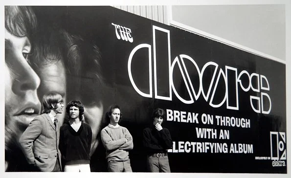
The Doors’ career went on to burn short and bright, with the Morrison/Manzarek/Densmore/Krieger line-up completing seven studio albums between 1967 and 1971. The original logo featured on four albums (although relegated to the back cover of ‘The Soft Parade’). It was dropped altogether for the fifth album, Morrison Hotel (1970), but subsequently dusted off for all manner of live albums, compilations, box sets and ‘Best of’s
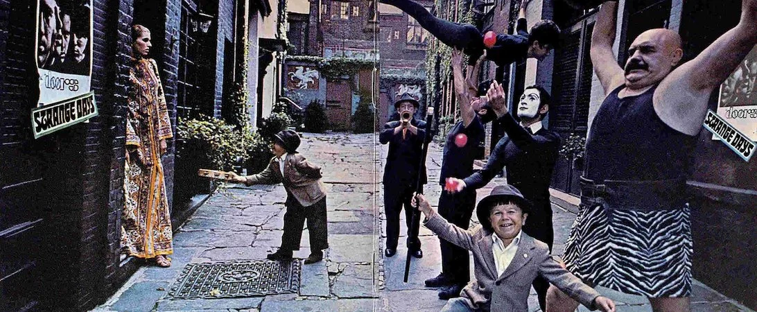
On ‘Strange Days’ (1967), there’s no standard titling on the bizarre outdoor street performance scene on the front cover conceived by Harvey and captured by photographer Joel Brodsky. But if you look slightly to the right of the bald, beskirted strongman, there’s a fly poster on the shop window bearing the logo, along with an advertising flash showing the name of the album. And there it is again on the fold-out back cover on the wall opposite.
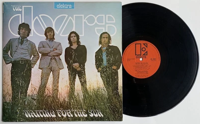
‘Waiting for the Sun’ (1968), sees a more idyllic outdoors band shot by Paul Ferrera. The Doors were photographed cliffside near Laurel Canyon Boulevard, dappled in evening sunlight, standing in long grass. Here, the logo is white, with the band’s heads obscuring parts of it. Smoke, the backward slanting, psychedelic font used for the ‘The’ of ‘The Doors’, has also been co-opted for the album title. In both cases, you can see through the outline of the lettering of ‘DOORS’ — perhaps some oblique reference to Aldous Huxley’s ‘doors of perception’.
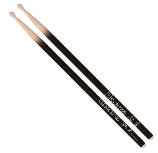
If you take a good look at it, the logo is surprisingly rudimentary, the main letters made up of crude, blocky rectangles, half circles and quarter circles. The two o’s, with their mirrored diagonal lines, could possibly be seen to resemble pills. But part of the logo’s charm is its perfect imperfection. The Doors broke the mould and they could be dirty, raw and dangerous — immaculate symmetry wouldn’t have suited them.
Their debut album (which included ‘Light My Fire’, ‘The End’ and ‘Break on Through’), proved to be their most successful by a country mile, going 4x Platinum in the US and 2x Platinum in the UK. And that’s undoubtedly why the eccentric ‘cookie-cutter’ logo is still so revered and remembered today.

By ‘Morrison Hotel’ (1970), The Doors’ logo had morphed into a surprisingly staid Copperplate Gothic version
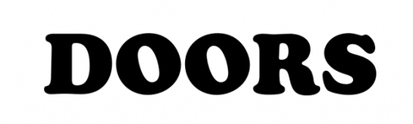
'LA Woman' (1971) used a plump version of Cooper Black for the logo. And the band’s name seems to have mislaid its definitive article