C2 — The Chemical Brothers
Anthony Sweeney harks back to his days at 1990s design studio Negativespace, and recalls how the Chemical Brothers’ other-worldly logo bubbled up to the top. He’s amazed and amused that it’s still in use today.
Unlike many of his peers, St Martin’s graduate Anthony Sweeney had no great yearning to get into design for music. In fact, he started out designing annual reports. But his brother went to college with Bob Stanley of indie darlings St Etienne … and one thing led to another.
By the mid-1990s, he was working in a small Soho studio with Mark Bown, former art director of Creations Records, home to Primal Scream and Oasis. Together, the pair traded as Negativespace.
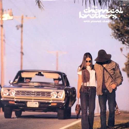
Done and dusted: The Chemical Brothers' debut album, ‘Exit Planet Dust’, featured an early outing for the Negativespace-designed logo. Originally, the designers’ efforts were based on another name (the Dust Brothers), which is obliquely referenced in the title.
The studio was handily placed above the offices of Heavenly Recordings, whose clients included little-known big-beat pioneers the Chemical Brothers. As often happened, the band were directed upstairs to get themselves a logo.
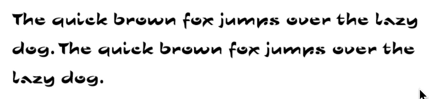
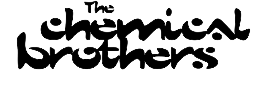
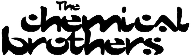
One for the Sho: Sho Roman was a Linotype casual script face by Karlgeorg Hoefer. Negativespace cut, pasted and messed with it, mimicking the way the Chemical Brothers made their music. The tweaked logo font was later digitised and expanded by a fan, which the designers used for titling purposes.
“Tom Rowlands and Ed Simons [aka the Chemical Brothers] were probably the nicest people I ever worked with in the music industry,” recalls Sweeney. “Like a lot of bands, they just wanted to make music and had no idea of how they wanted things to look. They brought in some record sleeves they liked for reference, but we tried to push them towards something more unique.”
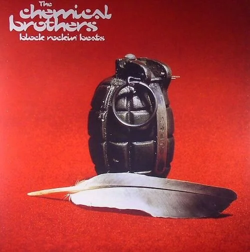
Explosive stuff: Negativespace often used a nearby photo library on Rathbone Street called Barnaby’s, which dealt in rejected (and often enigmatic) advertising shots. Reimagined and recontextualised, the viewer is invited to project their own meaning on to the record sleeve.
The designers came up with “pages and pages” of logo ideas, ranging from ‘sober’ to ‘crazy’. Somewhere near the ‘crazy’ end of the spectrum was an effort based on a Linotype typeface called Sho Roman. It wasn’t exactly a joke, but the “antithesis of what we thought of as good typography at the time,” says Sweeney.
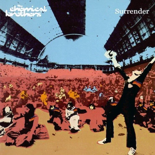
Next: After Negativespace disbanded, the Chemical Brothers design baton was passed to Blue Source, who came up with this award-winning cover featuring illustration by silk-screen artist Kate Gibb.
Sho Roman looked for all the world like a trippy, quasi-psychedelic 1970s font with its exaggerated curves, thick-thin lines and gap-happy letterforms. In fact, it had only been around for 18 months or so, when they stumbled upon it in a type specimen book.
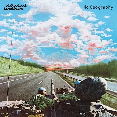
Still standing: The Chemical Brothers’ most recent album, ‘No Geography’ (2019), continues the tradition of esoteric cover art, and sticks with the 25-year-old logo. Design: Hingston Studio.
Sweeney and Bown simply scanned the necessary letters; trimmed, tinkered and tweaked them until the logo looked suitably scratchy yet coherent, and presented their creation along with 100s of others. Amazingly, it immediately spoke to the Chemical Brothers — who have been using it happily ever since.
“Looking back, [the logo] seemed to really fit with the Chemical Brothers’ philosophy,” says Sweeney. “It was a bit cut and paste, slightly overlapping, the characters all mashed together in a really quick way. But it also had this other-worldly quality to it, we’d never seen anything quite like it before. I still can’t tell if it’s genius or just a bit bad. It’s funny how these things take on a life of their own and really interesting to see what other designers have done with it since.”
Further reading: