E2 — Electric Light Orchestra
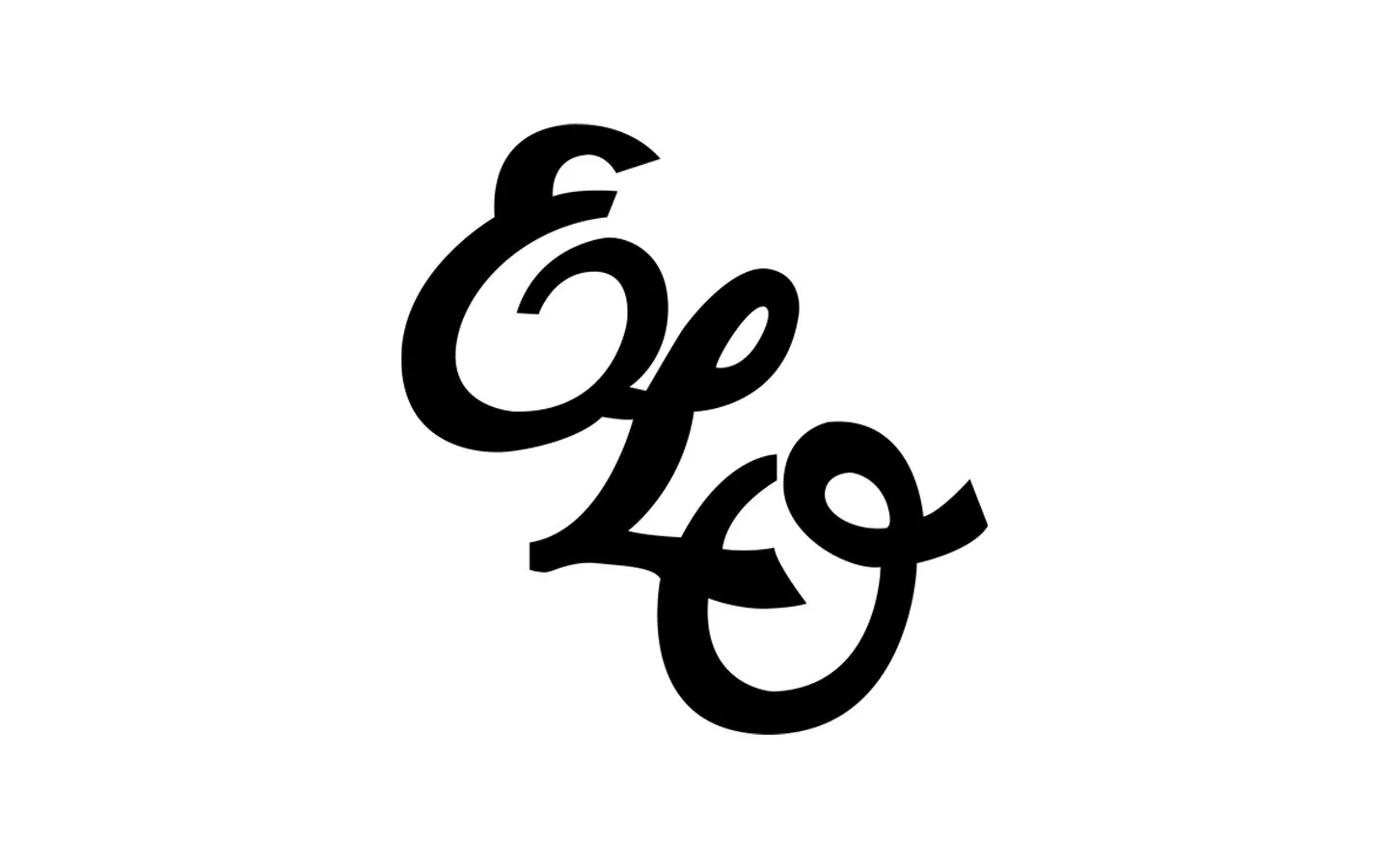
ELO’s radiant, out-of-this-world logo wasn’t specifically designed as one. It was part of a grander creative concept for the cover of the band’s 1976 breakthrough album ‘A New World Record’. Legendary art director Kosh explains all.

Kosh is the former art director of Apple Records and the man behind almost 2000 album covers, including all-time classics like ‘Abbey Road’, ‘Hotel California’ and ‘Who’s Next’.
When we reached out to Kosh, it was more in hope than expectation. But within an hour of emailing him, he’d responded: “I’d love to, it would be a real gas”. We were bowled over, to say the least.
He chatted to us from his base in LA, where he’s lived and worked since 1973. His English accent is still perfectly intact.
BLJB: How did your association with ELO come about?
Kosh: Without getting too longwinded, basically through connections at Apple Records. I’d recently arrived in LA and was called in to meet Don Arden, ELO’s manager … it seemed that whenever you met up with him, he was standing there like Jesus, with a couple of tailors chalking him up for a suit. He told me the band had a new album coming out called ‘A New World Record’, and he commissioned me to design the cover on the spot. That was it.
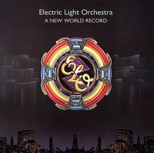
Sir Juke: Kosh’s idea for the Aurora Borealis background on ‘A New World Record’ came to him as he witnessed the phenomenon on a flight from London to LA. “I wanted to express the beauty of the twinkling stars showing through the curtains of light. It felt like pure Disney.”
BLJB: So there was no mention of a band logo per se?
Kosh: No, the logo came out of the larger design concept. In my mind, I felt the album needed some sort of colophon* and it had to say ‘electric’ and it had to say ‘music’. And because of the classical element in ELO’s songs, I wanted to make the imagery feel semi-pompous, but really rich.
My dad used to work the Wurlitzer jukeboxes in London, I grew up around them listening to the great influx of American rock ‘n’ roll 45s coming in … so I was heavily entrenched in the beauty of that Deco Moderne style. In the late 40s and 50s, jukeboxes were these gorgeous glowing jewels in the night ... that was before the hard, rectilinear look of the 60s.
It suddenly occurred to me that a jukebox illuminated by electric light and playing music summed it all up perfectly. The frame of the logo is the top of a 1940s 1015 Wurlitzer flipped to make a circle. The actual logotype in the middle is a pastiche of the GEC [General Electric Company] logo, a wry little joke, if you like.

It’s electrifying: Kosh’s ELOgotype gives a cheeky nod to the long-serving General Electric logo. This venerable piece of graphic design has an Art Deco vibe, and was originally created in the 1890s.
BLJB: So how did you physically create the logo?
Kosh: Well, you could probably bang that out in a couple of hours today … and do some alternatives. But in those days, first we did scratches and scribbles with Caran d’Ache crayons, which you then got approved. I think Jeff Lynne gave it the nod. Nothing more than a nod.
The final piece of artwork was all airbrushed and actually about four-foot square. It’s a very painstaking process and I worked on it with [artist and designer] Bob Hickson. You have to cut the Frisket, which is like a sticky cellophane, peel it back, spray the colour, hoping the colour doesn’t bleed underneath and ruin what you’ve already done. Which you tend to do at about three in the morning … and then you’ve got to start all over again. The whole procedure probably took three days and two nights before we got it presentable.
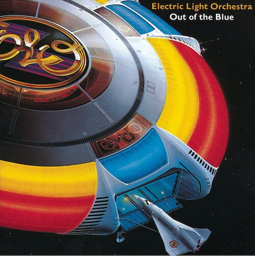
Blue-sky thinking: “[The design] was serendipitous. I stuck an ELO sticker on a Frisbee just because it looked good. I threw it to my young son, and it sailed through the air and I thought: ‘There it is … there’s ‘Out of the Blue’.” Released 1977.
BLJB: And then it developed a life of its own …
Kosh: Yes, we carried it over to the next ELO album ‘Out of the Blue’. It became the band logo from that point on, I guess … as opposed to a one off. Jeff Lynne’s ELO [the latest incarnation of the band] are still using it now, although it’s a slightly different version, for copyright reasons.
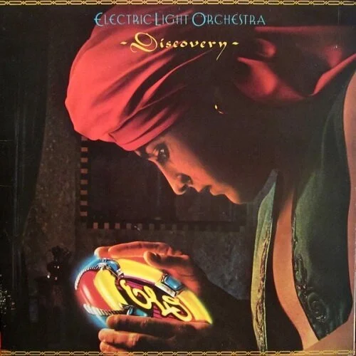
Strange magic: Norman Moore designed the cover artwork for ‘Discovery’ (1979), reimagining Kosh’s logo as luminous (perhaps extraterrestrial) treasure. “It was very different from the other rock logos at the time. It wasn’t hard, that’s for sure. It was glowing and enticing.”
BLJB: How do you look back on the ELO logo now?
Kosh: I had no clue it would be around for so long. Or any of my stuff come to think of it. I was just trying to pay the rent. In those days, budgets were pretty good. The record companies were making millions. If you’re spending thousands, that was a drop in the bucket.
But I’m still very proud of it, I have a huge version of it in my office. It was such a labour of love. Bob and I really slaved to make it perfect. I have no idea where the original went. All our art gets stolen. There’s some record company executive somewhere with the real one hanging on his wall.
* ICYDK: A colophon is a printer’s or publisher’s identifying inscription or logo appearing at the front or end of a book (sometimes also on the spine or dust jacket). They can be simple and descriptive, or highly elaborate.
Huge thanks to Kosh and Bob Catania for making this happen. A pleasure all the way.
Further reading: