N2 — Nine Inch Nails
From the moment he first clapped eyes on it, designer Ross Shaw was in awe of the brutal simplicity of the Nine Inch Nails logo. In a personal appreciation, he lauds its enduring graphic power.
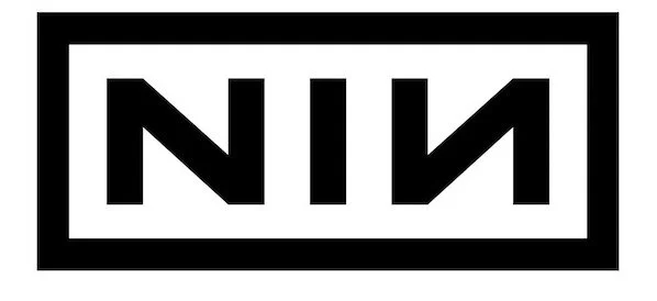
The NIN logo took inspiration from Talking Heads’ 1980 ‘Remain in Light’ cover (by graphic great Tibor Kalman), where the two upper-case A’s in ‘TALKING HEADS’ are rendered upside down. It was designed by Gary Talpas* along with NIN main man Trent Reznor, who wanted a striking insignia for his leather jacket.
I discovered Nine Inch Nails around 1991 when I was just 14 years old. At the time, I was listening to all sorts of metal and alternative music. There was something very different about Nine Inch Nails' music and aesthetic though. It was hard rock through a pop lens, and I loved it! It was heavy, but without the pomposity of metal and brought in the darkness of the best goth and new wave.
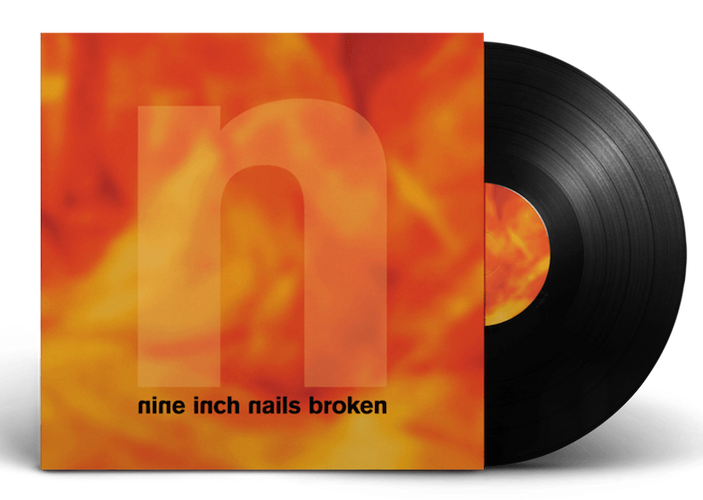
If it ain’t broke: The Broken EP (1992) featured clean, simple design by Gary Talpas with the logo (unusually) in lowercase and the n’s subtly reversed.
But for me, NIN was more than that, they became the gateway to a whole new type of music I’d never encountered before: Industrial. A musical genre that fused elements of twisted electronica, rock and experimental noise. Some of which I still love today.
Another reason NIN appealed to me was because of their outstanding artwork. Most of the early sleeves are credited to one designer, Gary Talpas, who created a visual canvas that felt perfectly in tune with the abrasive electronic music it represented. I’d listen to the music and pore over the sleeves, taking it all in — the spare modernist typography against textural abstract paintings and of course that logo.
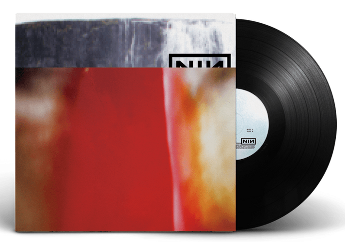
Half mast: The Fragile (1999) designed by the hugely influential David Carson, combined abstract, grainy, distorted and analogue with period typography and came with a lavish inlay booklet. Only a small portion of the logo is visible, but there’s still no mistaking it.
You’d think a band with a name like Nine Inch Nails would have a spiky, clichéd metal-style logo, so its cool rationality immediately sets NIN up as a different proposition. Its slick, modernist typography stands out in a sea of scratchy, grungy and homespun logos.
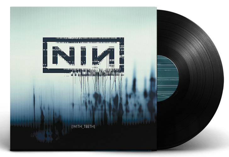
That’s dental: The album art for With_Teeth (2004) was created by US art director and illustrator Rob Sheridan. It’s pared back overall with the NIN logo seemingly unravelling on the cover.
The logo has been used in many ways, often distorted or cut up and yet even when used in small portions it’s instantly recognisable. For me though, it never looks better than when used white out of black, particularly on merch.
It’s a logo that could almost be a corporate symbol, and it’s this juxtaposition against the harsh music that makes it so subversive and interesting. It also avoids all the genre clichés.
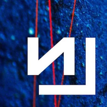
Almost boo: ‘Came Back Haunted’, the first single from 2013's ‘Hesitation Marks’ album with atmospheric, textural art by UK-based Russell Mills. Even with a fraction of the logo on show, it’s still instantly recognisable. The accompanying promo video was shot by US auteur director David Lynch.
I’m not sure how this logo could be improved upon and it’s never really changed over its 30-year history. It’s symmetrical, mathematical, modern yet timeless, reproduces well and achieves the holy grail of logo design in that it’s memorable, easily drawn (important for those school bags and pencil cases) and you can even write it out in text in any font — NIN (see?).
NIN are a band a lot of people are going to hate, but you’ve got to love that logo!
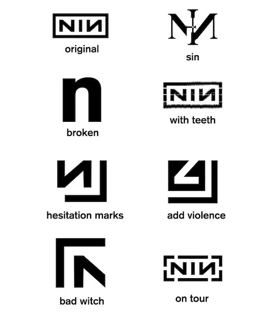
All change: The subtle evolution of the original Talpas/Reznor logo.
* We tried in vain to reach Gary Talpas to get his memories of designing the NIN logo, as well as being a sometime member of the band. However, as far as we can tell he has turned his back on the world of rock ‘n’ roll, and now works for a human resources executive search company in LA.
Further reading:
Nine Inch Nails’ official website
‘The Stain of Time v2: More than a Trent Reznor Biography’ by Remanon Last
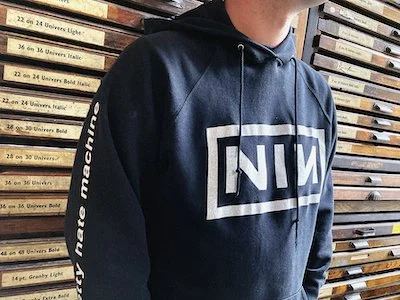
Big thanks to the wonderful Ross Shaw from all of us at BLJB for suggesting and writing this post. Here he is in his 28-year-old NIN hoodie that he uses for letterpress printing. Surprised it hasn’t got more ink on it.