I2 — Iron Maiden
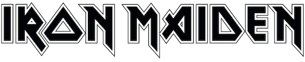
Jagged, angular, strangely runic, and with just a splatter of Teutonic camp, the Iron Maiden logo feels perfect for the band who led the new wave of British heavy metal in the late-1970s.

Seen in a variety of guises on the band’s 40 studio and live albums, the logotype sits firmly and unapologetically in the tradition of capitalised Black Letter-esque heavy metal marques, from AC/DC, to Kiss, to Def Leppard.

On me Ed: Iron Maiden’s self-titled debut album (1980) set the graphic tone for what was to come for the next 40 years. It featured Dennis Wilcock’s logotype in red with white outline, along with the first appearance of Eddie the Head, by Portsmouth-born artist Derek Riggs.
It’s generally accepted that the logo was designed by one-time band member Dennis Wilcock, along with art director Ray Hollingsworth. Bassist and founder Steve Harris, who’d briefly worked as an architectural draughtsman, has also been credited, but this is unsubstantiated and seems unlikely.
Wilcock, a flamboyant Kiss fan who went full make up and spat out fake blood on stage, fronted the band briefly from 1976–1978. But he left before Iron Maiden hit the big time to take up a career in advertising.
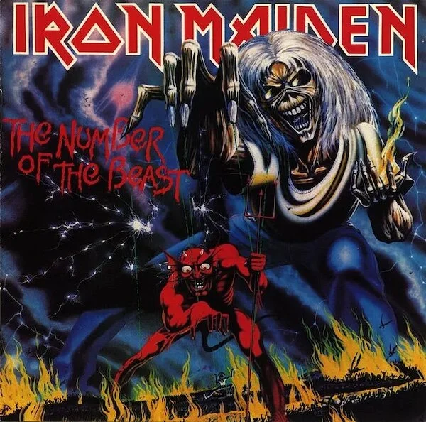
Number’s up: Based on a papier-mâché stage prop used as part of the band’s gothic stage act, Eddie the Head took on a life (or should that be death) of his own in Derek Riggs’ artwork. Note Eddie’s fingers mimicking the M of Maiden.
Wilcock then popped up again in 2018, when he sued Iron Maiden for £2m for allegedly stealing his lyrics for various tracks on the group’s self-titled debut (released in 1980) and their second, ‘Killers’ (1981). He claims that he completely turned his back on music and never knew that his words had been co-opted by his former band mates.
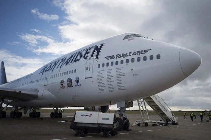
Maiden voyage: the logo sits proud on Ed Force One, the band’s flying tour bus, which is often flown by lead singer and pilot Bruce Dickinson.
While Wilcock’s contribution to the band’s musical legacy may be questionable, his claim to the band’s 40+ year-old logo is more substantial. In an interview with Maiden World, an Iron Maiden fan site, his ex-colleague and art director Ray Hollingworth recalls:
“The original logo design for Iron Maiden was created by Dennis Wilcocks [sic] with assistance from myself at Crowes Art Studio, Rathbone Place, London W1, sometime around September 1977.
“I clearly remember the ‘as off’ lettering arriving on a photostrip to be cut up and positioned to form the namestyle. I can even remember Dennis ordering the type and bringing it over to my desk. I assembled and re-touched the lettering that formed the logo. Dennis actually employed me, as he was the Studio Manager at Crowes.”
So, reading between the lines, the Maiden logo was based on an existing font, typeset on to a strip of bromide paper and then arranged, tweaked and kerned by hand, old-school style.
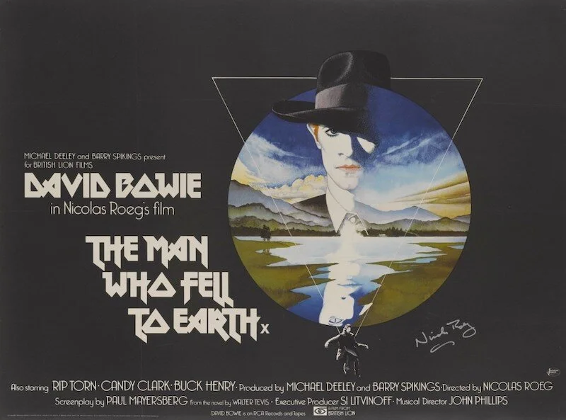
Star man: The brilliant Vic Fair’s poster for the Nicolas Roeg film ‘The Man Who Fell to Earth’ is arguably one of the greatest British film posters of all time. Here, the font takes on an otherworldly, etheral quality, quite different from the Iron Maiden LP covers.
The provenance of the original font is unknown, although it was certainly popular at the time. A version of it, without the key line, was used on Vic Fair’s extraordinary film poster for Nick Roeg’s ‘The Man Who Fell to Earth’. It also puts in an appearance as a logotype on several of British guitarist Gordon Giltrap’s late-1970s albums, and (ha!) ‘Nana Mouskouri Live at the Royal Albert Hall’ (1974).
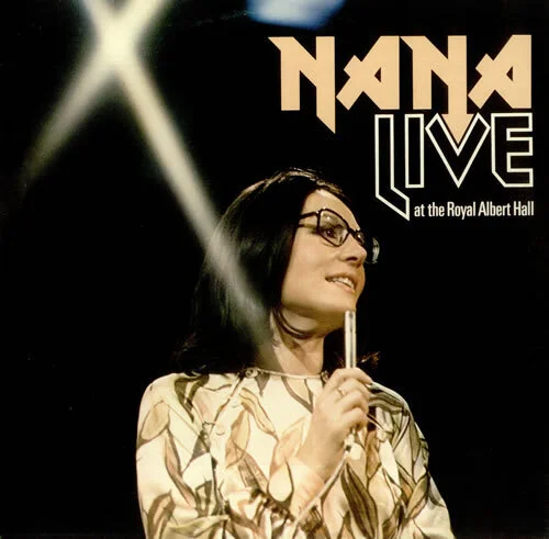
Soft metal: Picking up on the colours and shapes of Ms Mouskouri’s dress, the font feels clean and crisp. Note the tweak to the second N, which becomes an arrow occupying the negative space of the V.
It’s this telling keyline detail, however, that gives the Maiden logo its edgy ersatz-Nazi/biker gang aesthetic, redolent of enamelled WWII German military medals and chrome motorbike badging.
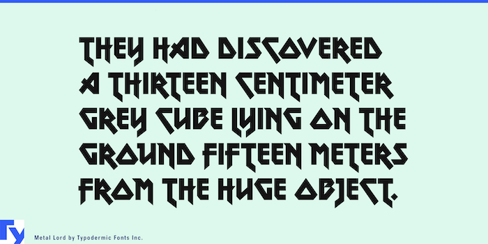
Oh my Lord: A message from Canadian typographic designer Ray Larabie … “If you use Metal Lord in an OpenType savvy application, you’ll see magic stuff going on: letters occasionally flip, tuck and grow little flags to fit nicely together, but not so much as to be distracting. I’ve added lots of punctuation, symbols, fractions and numeric ordinals, to the delight of high school teachers everywhere, I’m sure.”
Subsequently, a new font based on the Maiden logo lettering was drawn up and published by Ray Larabie of Typodermic Fonts in 1996. Larabie claims: “Metal Lord was loosely extrapolated from the letters in the Iron Maiden logo using the powers of imagination … and the powers of Satan”. Free bold and outline versions of Metal Lord are available to download on the Maiden World website. Run for the hills!
Further reading:
Spinditty article on Derek Riggs’s Iron Maiden album cover art
Film on Paper interview with Vic Fair