J2 — The Jam
Let us spray. One tiled wall, one can of spray paint and no idea of what he was going to do next. And yet, against all odds, art director Bill Smith managed to create one of the seminal band logos of the 1970s.

In 1976, Bill Smith was a year into his tenure as art director of Polydor Records, when he was asked by head of A&R Chris Parry to go and check out a band at the infamous Greyhound pub in Fulham. Recent signees to the label, they were called The Jam. Smith had little idea that this encounter would kick start a relationship that would produce five album covers, 17 single covers, and several ace band logos.
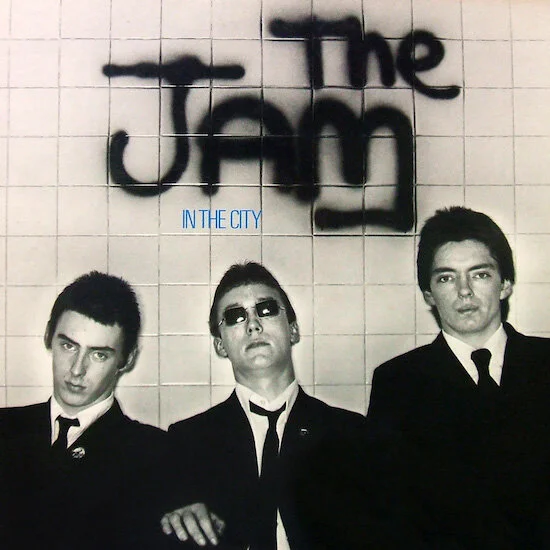
We lav you: Released on 20 May 1977 by Polydor Records, The Jam’s debut LP ‘In The City’ reached #20 in the UK Album Chart. It featured a cover version of the Batman theme as well as the first outing of art director Bill Smith’s spray-painted logo.
“For all of what was great about the energy and dynamism of a lot of the young bands back then, there’s a line of thought that they couldn’t really play and couldn’t really sing,” says Smith. “Whereas the Jam could definitely play and Paul [Weller] could definitely sing and write a great song.
“So I was immediately hooked on them. And not just from a musical point of view. They had a real look that defined them. They were on stage in their black suits and their white shirts and skinny black ties giving it their all. From the moment I saw them I knew I wanted to work with them and knew exactly what I wanted to do for their first cover.”
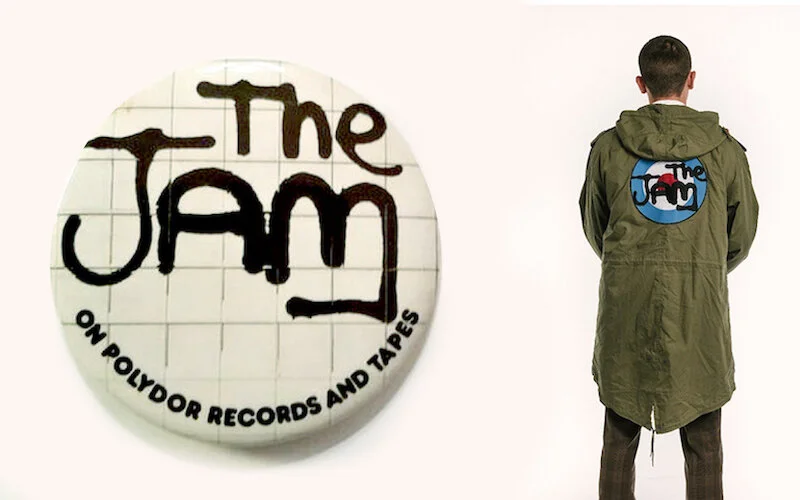
Parka life: The Jam are said to have sold over 200,000 official pin-badges bearing their first logo. While on www.fishtailparka.com, you can buy this classic piece of Mod outerwear for £145.
The rough-and-ready, spray-painted logo that’s now most closely associated with the band was created in a moment of pure happenstance. It wasn’t designed as a logo as such, but as part of the cover art for The Jam’s debut album ‘In The City’. Armed with the title, a solid grasp of the band’s attitude and aesthetic, Smith came up with a narrative to inspire the look, feel and subject matter of the record sleeve.
“The Jam were kind of outsiders. They were from Woking, not part of the London scene. I had this idea that the guys had been chased, by a rival band or rival group of fans or whatever,” says Smith. “And they somehow had managed to escape to an underground toilet. And while they were waiting for their pursuers to disappear, they graffitied their name on the toilet wall. They were completely up for it. They thought it was great.”
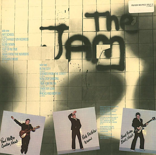
Flip side: The back cover of the ‘In The City’ sleeve. After the band had left the photo session, Bill Smith started smashing up the tiles and adding more graffiti, with photographer Martyn Goddard capturing the wall in various states of distress. The resulting images were used above, as well as on the label and inner sleeve.
Smith was adamant that the photography should be gritty black and white, even though there were raised eyebrows from the somewhat stuffy Polydor ‘higher-ups’. Smith duly roped in photographer Martyn Goddard to shoot the lads in a suitably seedy public toilet.
Goddard, however, was quick to see the flaws in this plan. Namely permissions, permits, lighting and people wandering in wanting to use the facilities. So instead, they got busy tiling a couple of 8ft x 4ft flats in Goddard’s studio, creating a makeshift backdrop that could pass for a public convenience. Smith liked the quasi-graph paper effect of the ungrouted 4-inch Crystal tiles, so they left them as they were. Then came the moment of truth …
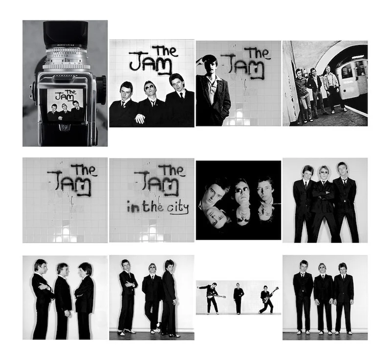
Suited, booted and photoshooted: Contact sheet from the ‘In The City’ session at photographer Martyn Goddard’s Kensington Church Street studio on 2 March 1977. Note a young Bill Smith top row, third from left.
“The band arrived, changed into their suits, and stood in front of the flats while Martyn sorted the lighting and took Polaroids. Then they stood to one side and I grabbed the can of spray paint. And thank God I got it right first time because there wasn’t going to be a second time … I just sprayed ‘The Jam’. I had no idea what it would turn out like, I just wanted it to be spontaneous and of the moment.”
The ever-restless Weller wanted a new look for the follow-up ‘This is the Modern World’, but Smith’s spray-painted signature has remained The Jam fan’s favourite ever since. To this day, it’s the staple patch of the Mod’s fish-tail parka and blazer-lapel button badge. Smith can’t be sure, but thinks the logo has stayed fresh and relevant thanks to its graphic urgency and evocation of late-1970s Britain.
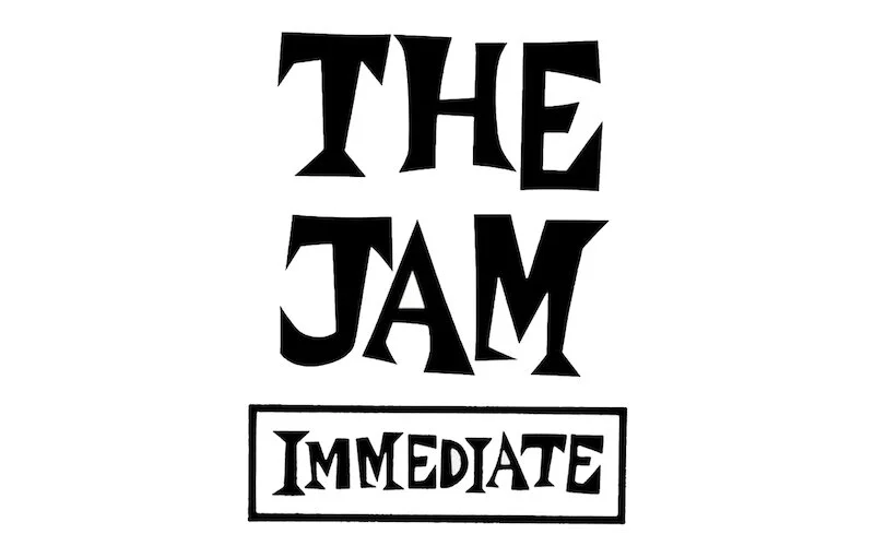
Homage sweet homage: For The Jam’s third studio album ‘All Mod Cons’, Bill Smith created a new logotype (top) that took inspiration from Andrew Loog Oldham’s Immediate Records marque (below). Paul Weller was a huge Immediate fan, as it was the home of the ultimate Mod band, The Small Faces. “The only letters that existed in that font were in the word ‘Immediate’, from which I extrapolated an entire alphabet,” says Smith.
“Most of my work is about immediacy,” he says. “Often the first ideas are the best and for me, they always start with listening to the music. Once in a while, everything comes together and just clicks, fits the zeitgeist to use that horrible word. It’s a simple idea. A simple logo. I’m thankful they were called The Jam. God knows what it would have ended up like if they’d been called the Stemplehoffs or something like that.”
Bill left Polydor Records in 1978 to set up Bill Smith Studio. He went on to design several hundred record sleeves for the likes of Kate Bush, King Crimson, Queen, The Rolling Stones, and The Cure.
Huge thanks to the wonderful Bill Smith for his time and recollections. If you’d like to know more about his work, Red Planet Books will be publishing ‘Cover Stories — The Album Art of Bill Smith Studio 1977 – 2019’ in April. It features 70 of his album sleeves, along with the many funny and insightful stories behind them. Watch that space!
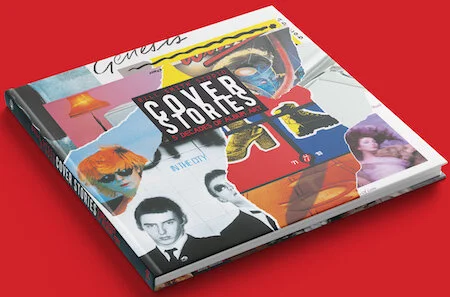
Bill Smith’s greatest hits: keep checking www.redplanetmusicbooks.com