M2 — Motown

The record label Motown was founded as Tamla Motown Records in 1959 by Berry Gordy Jnr. He was a budding songwriter who famously worked on the production line at Ford motors in Detroit before starting his new musical venture.
While Gordy was toiling away to the clunking rhythm of the factory floor, he dreamed of creating a new type of label for black artists – one that functioned just like the production line he was used to – but he dreamed of a factory for hit records rather than motor cars.
He hired writing team Holland-Dozier-Holland to work on the hits, employed crack jazz musicians the Funk Brothers to play the tracks and found some of soul music’s greatest singers to sing them. What ensued was a flurry of incredible records from The Supremes, The Jackson 5, Marvin Gaye, Martha Reeves and Stevie Wonder, to name but a few. And the rest, as they say, is history.
And of course, all these hit records needed hit covers and a hit label brand identity to match.
With a name borrowing heavily from its birth place in Detroit (known locally as Motor City or Motor Town) it’s no surprise that the first logo to adorn the early Motown records was some cleverly hand-drawn car-shaped type. Neatly using the two O’s of Motown to create the wheels – it was a cute idea – but perhaps not right for a forward thinking record label, with ambitions to sell records all over the world. After all if you didn’t know they were from Detroit, then what did soul music have to do with motor cars?

Logo-a-go-go: Motown had a series of less memorable logos before the iconic stencilled M of 1965.
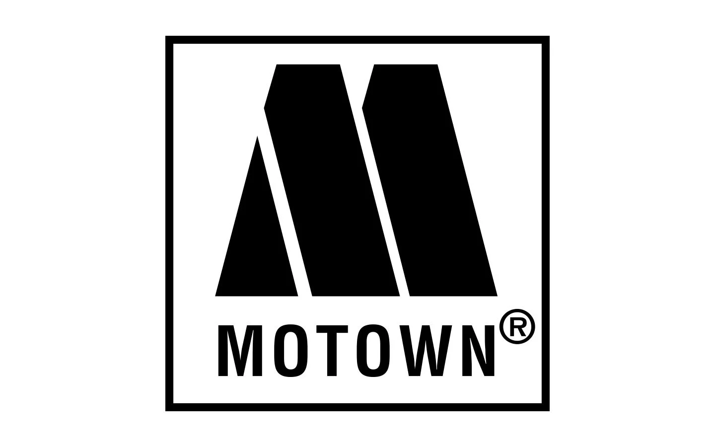
Several other logo options cropped up over the next few years before settling on 1965’s iconic stencilled M logo that we all know and love today. Still in use over 50 years later, this classic logo was designed by Motown’s little-known resident art director, Bernie Yeszin, who was hired by Gordy in 1962.
During a six-year run at the label, Yeszin was behind some of the classic album covers that came out of the label at the prodigious rate needed to keep up with the hit factory’s outpourings of musical greatness. But it’s probably the stencilled M logo in the corner of the covers that’s his real design legacy.
Amazingly, all Yeszin’s work was created from a makeshift attic office space at Motown’s infamous house on West Grand Boulevard, known as Hitsville. Yes, Motown literally had an ‘in-house’ design team.
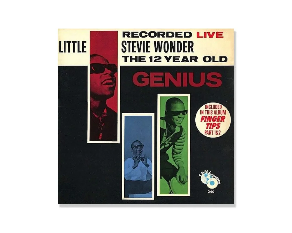
Signed Sealed Delivered: One of Yeszin’s first designs to leave the attic of Hitsville was for the then child star Stevie Wonder.
“I went in, met Berry Gordy and got a job in the art department,” he told LA Weekly in 2013. It wasn’t long before the only other staffer in the art department left, and Yeszin was suddenly left in charge. “I didn’t know a thing, really,” he said. “I just had an eye.”
The M monogram is now forever synonymous with black soul music. Solid, bold and confident, it could be interpreted as tyre tracks or even stage lights – but the logo’s roots are actually deep in the German and Swiss type design movement. The M is a lift from the experimental typeface Futura Black by Paul Renner (designed in 1929) and the MOTOWN type that sits below is Neue Haas Grotesk Bold Condensed – better known as Helvetica Bold Condensed – designed by Max Meidinger in 1957.
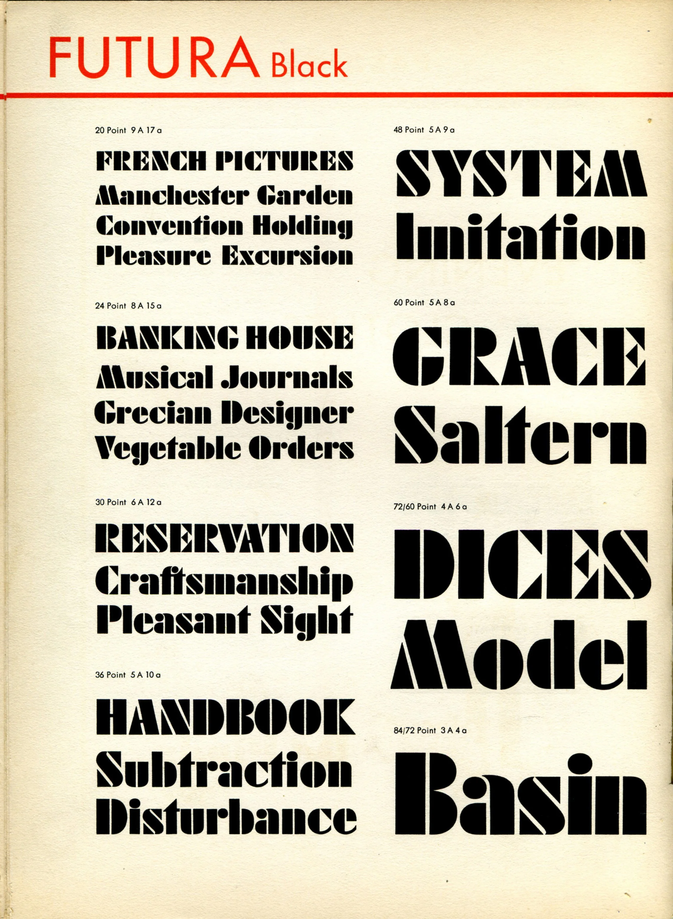
Black and proud: An early type specimen of Futura Black, an experimental stencil addition to Paul Renner’s otherwise geometric sans serif classic Futura. Designed in 1929 for Bauer Type.
It’s these typeface choices that give the Motown logo a timeless quality – and show that Yeszin obviously knew his design history too. In a time of groovy fonts and psychedelic visuals, he had the foresight to keep the record label’s logo clean and simple enough to stand the test of time and work on a multitude of different cover designs. Interestingly, Monotype have recently recut and rebooted both typefaces for the digital age as Futura Now and Helvetica Now – which only helps make this Motown logo feel even more contemporary.
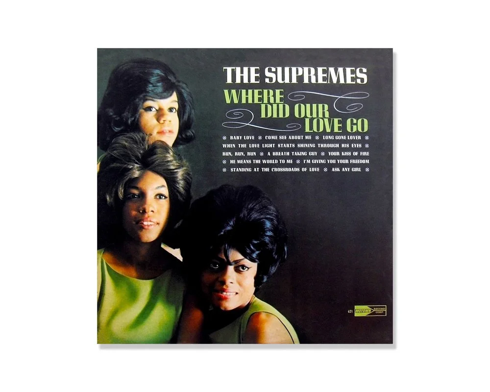
Supreme typography: Another of Yeszin’s early works for the Supremes in 1964. It’s obvious from this cover that Yeszin had a keen eye for typography and supreme taste when choosing the right type for the job.
As a designer and art director, Yeszin was ahead of his time in many ways. After Motown he went on to work in TV, winning an Emmy in 1990 for his art direction on the Tracey Ullman Show. And before his death in 2014, he apparently plied his trade as a dog trainer – a man who never stood still and left us with a classic logo that looks as fresh today as it did in 1965.

Mo Motown: Recent classic reissues from the Motown stable – still featuring that stencil M.

I Want You Back: The relaunched Motown Records features a host of new artists – but their website design still revolves around that big ol’ M.
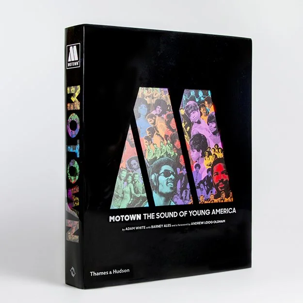
Motown The Sound of Young America. A visual delight for lovers of soul and typography. Featuring lots of Yeszin’s early work.