L2 — Led Zeppelin

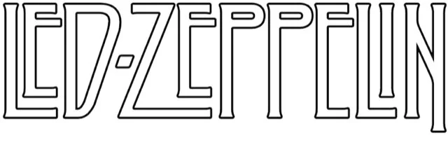
The arrangement of letters most people recognise as the Led Zeppelin logo came about more through happenstance than intention. Actually, it wasn’t even designed as a logo, but as part of the titling on a wraparound (or obi) on the US release of Zep’s fifth album, ‘Houses of the Holy’ in 1973.
Masterminded by arch-conceptualists Hipgnosis, the extravagant gatefold cover was inspired by Arthur C Clarke’s sci-fi novel ‘Childhood’s End’, which climaxes with all the children of the world drawn moth-like towards a glowing light and falling off the end of the Earth.
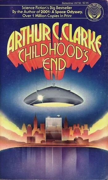
Now you C me: Regarded by many as Clarke’s finest novel, ‘Childhood’s End’ is the story of a seemingly benign alien invasion that isn’t all it seems. The final scene of the book inspired Hipgnosis’ darkly luminous cover for ‘Houses of the Holy’.
The making of the cover image is well documented. There’s a great first-hand account of the trials, tribulations and photo-trickery involved by Hipgnosis founder Aubrey ‘Po’ Powell in ‘Vinyl. Album. Cover. Art. — The Complete Hipgnosis Catalogue’ (Thames & Hudson, 2017). And a good truncated version of the story here on ultimateclassicrock.com.
But for the purposes of the logo story, it should be noted that said image features 11 naked, androgynous children clambering over Giants Causeway in Northern Ireland. It’s actually only two children (siblings Samantha and Stefan Gates) in various poses and dimensions, collaged on to a psychedelic orange, turquoise and purple background.
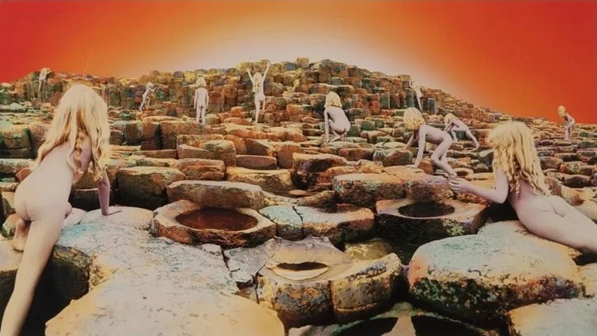
Let it shine: artist Philip Crennel hand-tinted Aubrey Powell’s photo collage, applying layers of water-soluble dyes with a brush and airbrush, to create an intensely powerful, other-worldly ambience.
Almost 40 years on, the ‘Houses of the Holy’ cover still causes controversy. In 2019, Facebook, those arbitrary arbiters of morality, banned it. After something of a stink and a change.org petition, they reversed their decision, admitting it was a ‘culturally significant’ image.
So you can just imagine the hoo-ha it stirred up in the conservative heartland of early 1970s America. A paper wraparound, covering the most prominent child buttocks (while also compensating for the absence of band name or title on the cover) seemed an acceptable compromise. Even for Zep’s notoriously uncompromising manager Peter Grant.
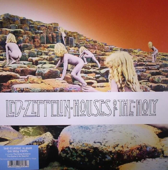
Dear prurience: “Even then [with the Bush Hollyhead-designed wraparound softening the nudity], there were people who were concerned about it,” Powell recalled in a ‘Rolling Stone’ interview. “But I always used the adage, ‘When you look at the Louvre’s paintings, it’s full of naked children.’ Nobody complains about that. So this is a piece of art. It’s not something that was, in any way, devious.”
However, the album was still banned or simply not for sale in parts of the southern United States for years. Despite this opprobrium, it was still nominated for a Grammy award for best album packaging in 1974.
The rather beautiful hand lettering on the obi was supplied by the outrageously talented Bush Hollyhead, one of four illustrator/designers plying their trade at NTA Studios in Covent Garden in the 1970s. Among their number was George Hardie, who designed the cover of the first Led Zeppelin album when he was a student at the Royal College of Art. He didn’t, however, feel it was good enough to be included in his degree show.
In its entirety, the reference point for the obi lettering is crystal clear. The double crossbars on the H’s, the floating, underlined Os, the small decorative flourishes, are pure Charles Rennie Mackintosh. Which is entirely apt, as the Glasgow School was fascinated by Celtic themes and mystical symbolism.
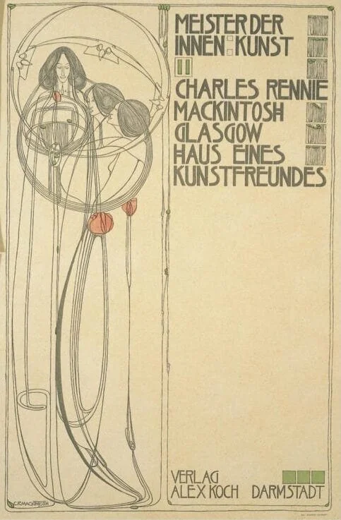
Return of the Mack: The cover page of ‘Haus Eines Kunstfreundes’ (‘House of an Art Lover’) by Charles Rennie Mackintosh and his wife Margaret Macdonald. Note the H with double crossbar and the elongated stems of the R and the F.
Moreover, the long column-like letterforms evoke the strange black rock basalt formations of Giant’s Causeway. They suggest stone carving and an ancient druidic religion. But because they’re in outline and hand-rendered, they have a certain human fragility too. Hollyhead had a reputation for working fast, so there’s a slight unevenness and inconsistency — apart from the Ps of Zeppelin, letters that appear more than once do so in different sizes and with slightly different detailing.
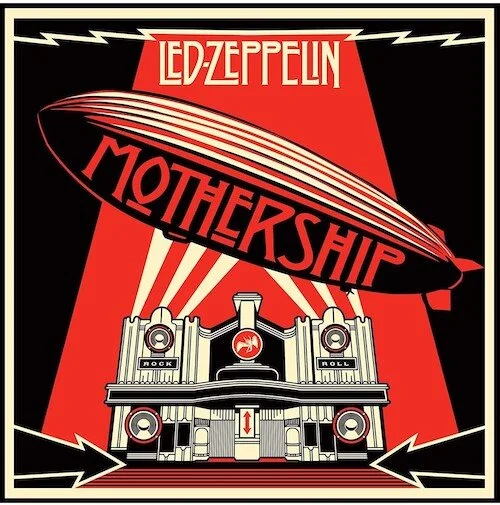
Mum’s the word: ‘Mothership’ was a greatest-hits album released in 2007, with artwork by Shepard Fairey. It featured the classic Led Zep logo, along with extrapolated Glasgow School letters for the title. The building in the background is based on the former art deco Beresford Hotel on Sauchiehall Street, Glasgow.
Somewhere along the line, the band’s name was cut loose from Hollyhead’s titling, cleaned up and morphed into the honorary Led Zeppelin logo. Profoundly powerful and rock-like, it still manages to glow with the delicate mysticism of its original setting.
‘The band loved it,’ said Aubrey Powell, talking to ‘Eye’ magazine. ‘What a genius that man was.’
In memory of Bush Hollyhead (1949–2020).
Many thanks to the wonderful Rick Banks of Foundry 37 for typographic help on this post. And to former Hipgnosis designers Richard Evans and Colin Elgie for filling in some gaps for us.
Further reading:
Carouselambra by Jay Larabie, a font based on the ‘Houses of the Holy’ lettering