Fontastic! Can you identify these groovy Sixties bands from just one letter culled from their logos?
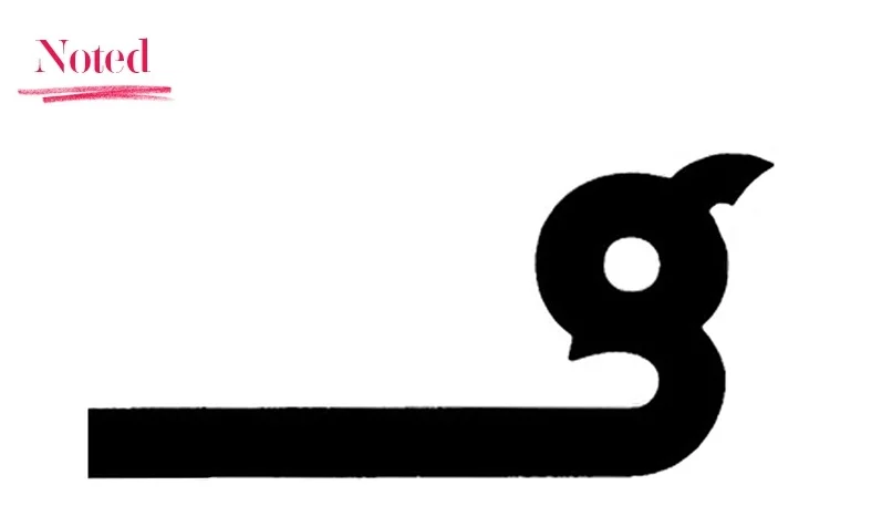
Fontastic! Can you identify these groovy Sixties bands from just one letter culled from their logos?
Banned in Germany, embraced in the US, the KISS logo still divides opinion, more than 40 years after its first appearance.
The death of Linkin Park frontman Chester Bennington was respectfully and typographically marked with a subtle change to the band’s logo.
The good people at Dorothy have designed a rocking pair of alphabet posters based on the first letters of 26 band logos. Take your pick from ‘Alphabet of Rock’ or ‘Alphabet of Alternative Music’.
They asked for something ‘barbaric’, and Stylorouge duly delivered. The dancing Jesus Jones logo is still in service nearly 30 years later.
Why have one logo when you can have 100s? Writer Patrick Baglee waxes lyrical about the graphic and sonic experimentation of German electronic pioneers Tangerine Dream.
Inspiral Carpets’ spaced-out cow logo was originally sketched by keyboardist Clint Boon. According to his less-than-discreet band mates, he had something of a fetish for these farmyard favourites.
Designed before they had a record deal, the logo for The Heavy was a monolith the band grew to fit. The marque was ‘dashed off’ by the lead guitarist’s younger brother.
Sleek, chic and oblique, the Groove Armada logo passes the ‘T-shirt’ test with flying colours. Neil Bowen of Zip recalls its birth 20 years ago.
Enchanted by the spell of prog rock and captivated by Roger Dean’s Yes logo, writer Fraser Southey recalls the moment his 14-year-old self went over to the ‘other side’.
A few weeks ago, the BBC launched a band logo quiz on its website. For seasoned BandLogoJukeBoxers, this should be a breeze, however, there are a couple of banana skins. Please have a go if you think you’re band logo hard enough.
The Funkadelic logo arrived without much fanfare on a poster inside their fourth album, ‘America Eats Its Young’. But from then on it became a fixture, part of the band’s fantastical visual and musical tapestry.
Fiona Thompson recalls her gritty 1980s life, transported by a band logo that looks like an aspirin, from a band that was always likely to give you a headache.
Who doesn’t love a dog? And a cheeky cartoon dog … even better. This was the stroke of genius behind East 17’s canine band logo, executed to perfection by UK design duo Form (aka Paul West and Paula Benson).
Like some precious old master painting attributed to ‘Anon’, the genesis of The Doors logo remains shrouded in mystery.
Gunky and punky, The Cramps logo bears a suspicious resemblance to alien goo slip-sliding down a cemetery wall.
The sleeve for ‘Orgasm Addict’ was 21-year-old Manchester Poly design student Malcolm Garrett’s third paid job. It featured the finished version of his evergreen Buzzcocks logo.
It seems fitting to be kicking off the perpetual BandLogoJukebox with a logo that runs from A to B and back again.